Guide to Making Basic Page Changes in WordPress
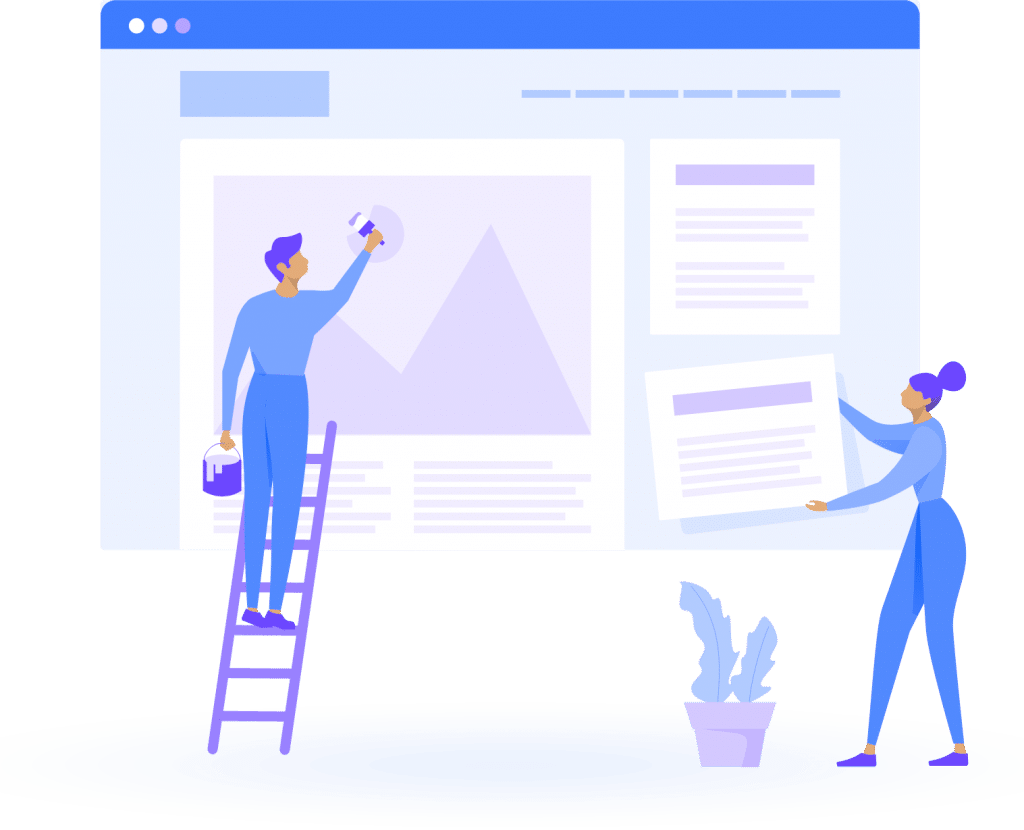
This guide collates instructions and help on how to make basic updates and changes to your website pages in WordPress. Sometimes you just need to make a small change to an image or text somewhere on your website, this guide will assist you in making those changes.
Pages
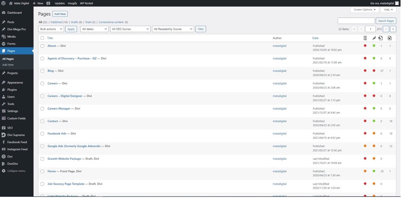
The Pages tab navigates to pages on your website. Pages are styled with the assistance of the Divi builder plugin. From the Pages tab, you can access website pages to make edits such as adding new content, updating stats or data, or replacing images. From the back-end, the page tab is quite similar to the Post tab and you can navigate it in a very similar way.
Editing a Page
Select the page you wish to edit – this will open up the selected page.
Click the blue “build on the front-end” button – this wiBl open up the Divi builder which allows you to make changes to the site visually on the front-end.
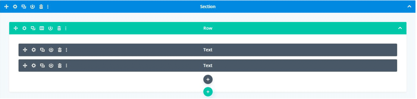
With Divi, websites are built using three types of boxes: sections, rows, and modules (see the reference picture below).
Blue Sections are used to organise Rows.
Green Rows are used to organise Modules.
Grey Modules are used to add content such as text, images, videos, or other graphics.
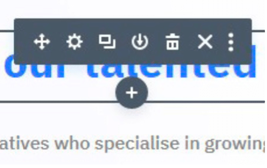
On the front-end with the Divi builder, you can see the way sections, rows, and modules are structured by the coloured outlines that are visible when hovering over the content. To edit a section, row, or module click the content and you’ll notice coloured menu boxes containing icons will appear.
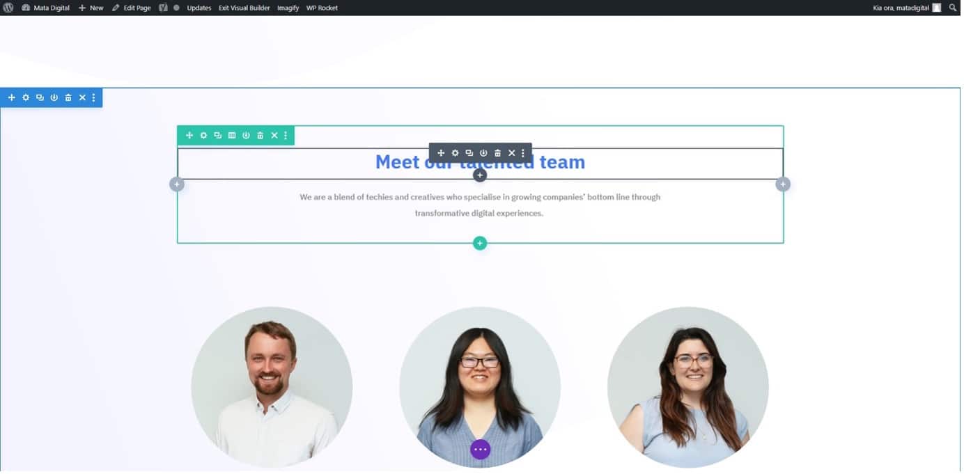
Each icon offers different options for the selected section, row, or module, the first icon which looks like four arrows allows you to drag and drop the module, section, or row to a different position on the page. The selected box will snap to available rows/ sections. Keep in mind the same hierarchy must be maintained, Sections contain Rows which contain Modules.
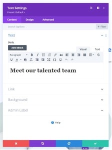
The settings icon allows you to edit the settings for that selected section, row, or module. Clicking this icon will open a purple popup box to edit content, design, and any advanced settings. In the example pictured left, since it is a text module selected you can change text, but if this was an image module, this would be where you change or upload a new image from the media library.
Settings will vary across the three tabs in the popup box for different modules. Explore these tabs to get familiar with what’s possible when using the Divi builder. In order to get comfortable using the Divi builder and making changes, it’s a great idea to make a test page. From the dashboard, go to “Pages” > “Add new” – this will open up a new page. Give the page a name, such as TEST, then select the blue “Use the Divi Builder” button to build a page from scratch and practice your Divi building skills. Use this test page to experiment and explore the settings across modules, sections, and rows. This will not be visible to the public because it will not be linked anywhere on the site so there is no need to worry about whether the page is visible to the public.
The next icon in the menu is the two rectangles. When clicked, this button duplicates the module, section, or row. This is handy for ensuring the settings for a section, row, or module are exactly the same and it’s more efficient than creating another module, section, or row and having to go through and manually change all the settings to be the same.
The next icon, the down arrow in the circle, will add that section, row, or module to the library. Once in the library, you can add this section, row, or module anywhere else on the site with ease.
The trash can icon in the menu will delete that row, module, or section. Click this when information on your site is no longer relevant and you would like to remove it.
The Cross icon within the menu will simply exit the menu and close it.
The three dots in the menu will display additional options when clicked. Though many of these will be irrelevant and you will not need to use them.
Adding a new section, row, or module
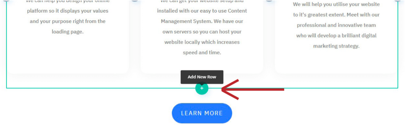
New, sections, rows, and modules can be added by selecting the coloured plus that appears. The colour of the plus corresponds with the type of box that will be added. Select an existing section then click the blue plus to add a section, select an existing row then click the green plus to add a row, or select an existing module then click the grey plus to add a module. You can create a new section, row, or module from scratch or add a saved version from the library.
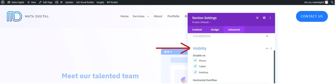
Disabling the visibility of a section, row, or module
If you want to turn off a section, row, or module without deleting it, this can be done in the advanced tab of the settings popup box. In the Visibility section, simply check the boxes for the devices you would like it disabled on.
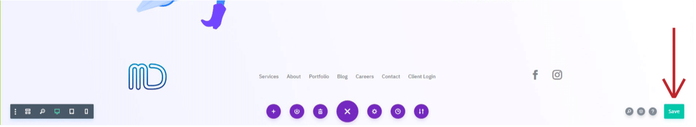
Saving your changes
To save any changes you have made, click the purple circle button with the three dots at the bottom center of the page. This will bring up additional options including a green “Save” button in the bottom right corner. Click this to save your changes.
Viewing different screen sizes
Sometimes you may wish to see how your website looks on mobile or tablet. You can do this by clicking the purple circle button with the three dots at the bottom center of the page. Within the additional options that pop up, a grey box will appear in the bottom left. Here, you will see the three different screen sizes, click on the screen you would like to view and toggle between these to preview them.
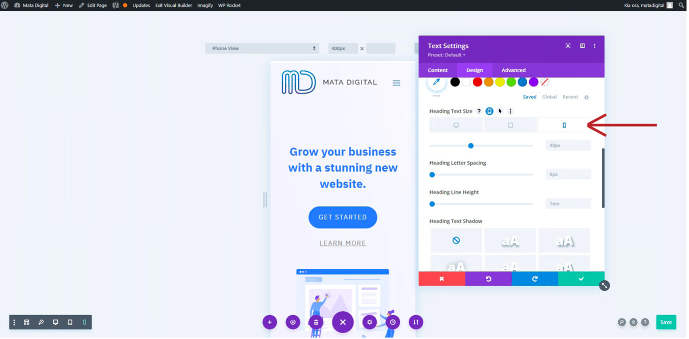
You can make edits and adjustments for specific screen sizes when previewing these exactly as you would when viewing the site in the default computer mode. For example, you may wish to decrease the size of a heading on mobile because it looks too big on a smaller screen. To make this edit, follow the same steps you usually would. For this example, you would click on the module you would like to edit > select the “Settings” icon > navigate to the “Design” tab. Since this is an H1 heading, go to “Heading Text” > “H1” and hover over “Heading Text Size”. Upon your hover, you will notice some icons appear, click on the icon that looks like a small screen device. This will bring up three boxes for the different screen sizes, allowing you to make changes specific to that screen size. Select the mobile screen size then decrease the text size and you will notice the text getting smaller. When you are happy with your changes, click the green tick to apply your changes then press save.
Navigating between pages on the front-end
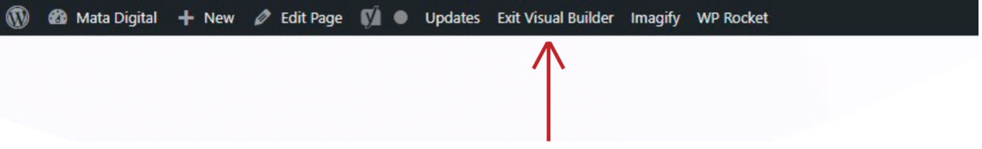
It’s possible to navigate between pages using the website’s menu, buttons, or links embedded within the site from the front-end when signed in. However, to do this you must first exit the visual builder. Select the “Exit Visual Builder” option from the menu along the top of your screen, ensuring you save your changes first. Select the menu item, link, or button to navigate to where you would like to go. Once the page has loaded, select the “Enable Visual Builder” option from the same menu along the top to open the Divi Builder once again.
Exiting the visual builder
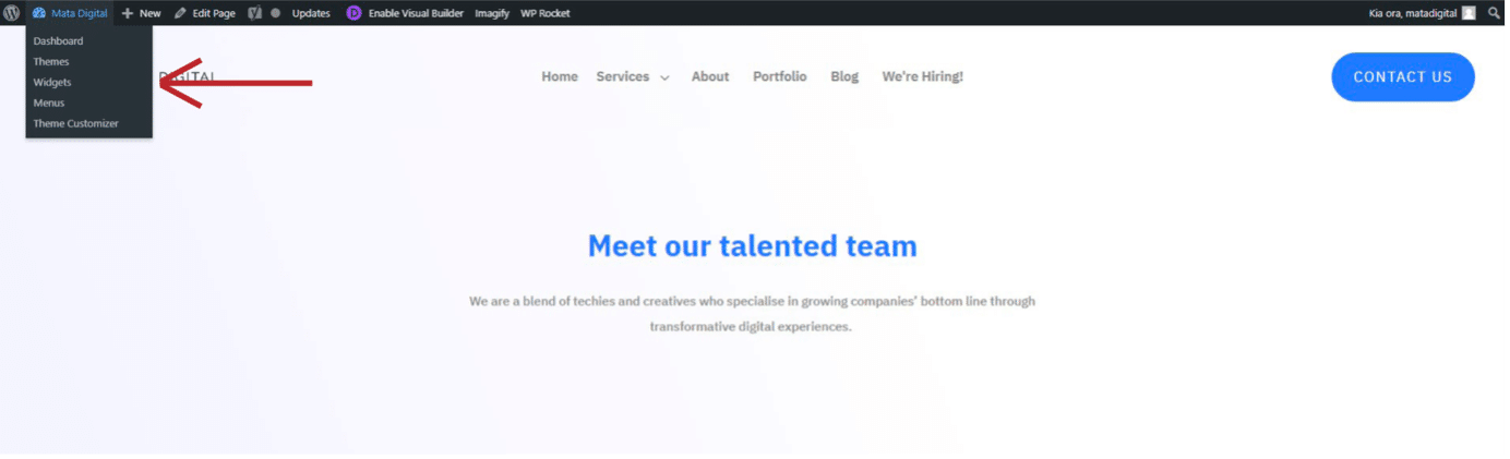
When you have finished making edits to the website pages, you may wish to navigate back to the dashboard. Hover over the business name in the menu along the top of your screen, ensuring to save your changes first. Upon hovering, a submenu will appear, select “Dashboard” from these options to return to the back-end of the site.
Now you can go through your WordPress site with more confidence to make basic website changes. This guide is only meant for simple updates, changes, and maintenance of your site, some websites require more complex and specialised training.
If you are in need of some website training or need more complex changes to your website, then get in touch with us here at Mata Digital today. Anything website related can be fulfilled by the team at Mata Digital, we are happy to help.
For assistance reach out to [email protected] or call us on 0800 00 27 86